- Jan. 23rd 2022 1:52 pm PT
0Apple’s home strategy has been all over the place, but the company appears to finally have a hit with the HomePod mini. Rumors have been floated about Apple making a HomePod with a display, but word on the street is that the product being tested looks a lot like an iPad mounted to a speaker. Instead of making a Frankenstein product very similar to Google and Amazon’s products, Apple should take the blueprint it’s laid out with HomePod mini and use it as a basis for a unique ambient smart display.
An angled circular display
The top surface of the HomePod mini lights up with colorful Siri animations, but it can’t actually display any sort of content or controls. In fact, the HomePod mini has volume controls printed on the surface, which would obstruct any visuals. HomePod mini’s design, however, is a lovely complement to nearly any space. And the vibrant colors introduced last year help add a pop of fun to drab rooms.
HomePod mini’s light-up surface is on the top of the device, but I propose that Apple angle the surface and add a proper touch display. The new angle would allow users to more easily use controls and view content – it’d be far better and add more utility to the product.
HomePod mini is already powered by Apple Watch’s S5 chip and it runs a variant of iOS called audioOS. The technology is already in place to power a small smart display. The software for this smart display could be based on watchOS and even feature faces from the Apple Watch.
Apple Watch faces
The ‘HomePod touch,’ as I like to call it, could start with a customizable clock that lets you choose from a handful of circular Apple Watch faces. Below you can see what Utility and the Mickey Mouse faces would look like on HomePod. This new functionality would turn the HomePod mini into a particularly good bedside alarm clock.

Controls for apps
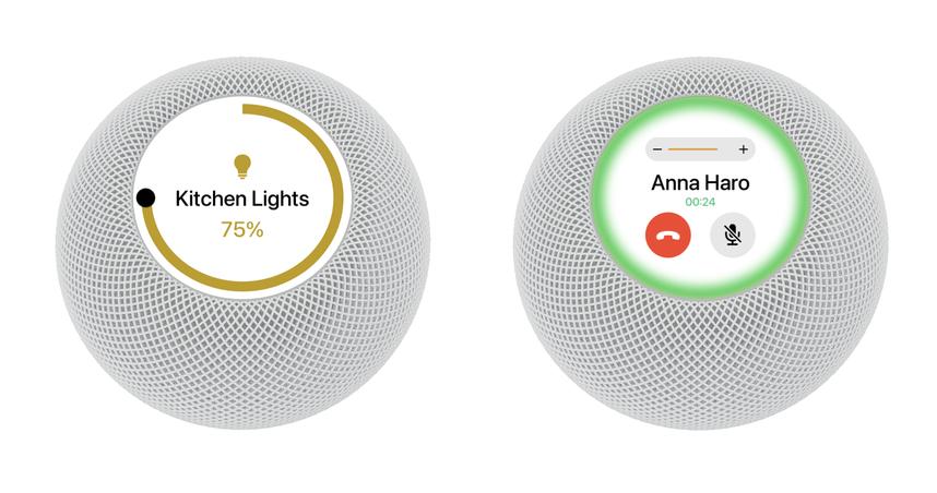
But a clock isn’t the main reason HomePod mini should gain a display. It should gain a display for utility. You could ask Siri to show home controls for lights and other accessories. HomePod mini is great for calls since it offers vastly improved audio. A display could show the name of the person you’re talking to, a mute button, an end button, the length of the call, and more.
The space gray HomePod touch would have a consistent black background that works perfectly with watchOS user interfaces. The white HomePod touch could use a persistent white background that complements the physical design of the product. I imagine the HomePod touch with an LCD rather than an OLED to allow for the persistent bright colored backgrounds, particularly since the display would be on at all times removing any sort of fear of burn-in and keeping the price low.
Media controls
HomePod mini’s primary feature is as a speaker. It’s great for Apple Music, Apple Podcasts, and as a speaker for Apple TV. Currently, you can use double and triple taps to move between content, but a display would show off album artwork and more controls. The circular display could even be used for a slick ring-style progress indicator.
Tapping on the album artwork could fill the whole circular display with it. A simple flick on the album artwork would let you move forward and backward.
Fun, fresh colors
The new colors that Apple introduced for the HomePod mini in November gave the product a breath of fresh air. The yellow and orange colors in particular really light up a space. The colors have been very difficult to get and have helped the HomePod mini grow in popularity.
For the HomePod touch, Apple could offer green, blue, and pink options as well as white and space gray. They’d all have matching braided cables like the standard HomePod mini and rubber bottoms to stay in place on a table.
Pricing strategy
The HomePod touch would effectively be the current HomePod mini and its great speaker coupled with a small Retina display. The current HomePod mini is priced at $99 and the HomePod touch would effectively add a built-in Apple Watch. You can look to the Apple Watch Series 3 at $199 and remove all of the health sensors, water proofing, and more expensive materials. HomePod touch would ideally be priced at $199 and be an obvious step up from the HomePod mini.
The display and added functionality would make a good case to any consumer shopping for a simple home smart speaker. And customers who already have HomePod mini could seamlessly add a HomePod touch into their current setup. You could even create stereo pairs with HomePod touch and HomePod mini.
Conclusion
What do you think about this idea for HomePod touch? Would you buy a HomePod mini with a circular display and a variant of watchOS? Let us know in the comments below!
FTC: We use income earning auto affiliate links. More.
Check out 9to5Mac on YouTube for more Apple news:
You’re reading 9to5Mac — experts who break news about Apple and its surrounding ecosystem, day after day. Be sure to check out our homepage for all the latest news, and follow 9to5Mac on Twitter, Facebook, and LinkedIn to stay in the loop. Don’t know where to start? Check out our exclusive stories, reviews, how-tos, and subscribe to our YouTube channel9to5Mac Concepts
About the Author
Parker Ortolani
Parker Ortolani is a marketing strategist and product designer based in New York. In addition to contributing to 9to5mac, he also oversees product development and marketing for BuzzFeed. A longtime reader, Parker is excited to share his product concepts and thoughts with the 9to5mac audience.


