Hot on the heels of Nanoleaf's Shapes and Essentials lines launched last year, Nanoleaf has released its Nanoleaf Elements line, kicking things off with some very cool-looking wooden light panels.
The Nanoleaf Elements Wood Look Hexagons are modular lighting panels designed to look like an elegant piece of home decor - and not a cool background for hardcore gamers. This is a welcome shift from Nanoleaf, which needed some "grown up gear" if it was going to be a real player in the smart lighting game.
The big difference here is that these panels are made from a laminate plastic with a wood grain finish (like laminate flooring). This means instead of a blank white lighting panel on your wall, the Elements double as a piece of wall art even when they're not lit up.
We've had a set of Nanoleaf Shapes in our home for a few months and while we love them as a very cool-looking extra light source in our dark living room, when we turn them off (such as while we're watching TV) the blank-panel-look is rather unattractive.
Read this: Complete guide to Nanoleaf
The wood-look of the Elements goes a long way to curing this issue, adding an interesting textural and architectural element to your wall whether the lights are on or off.
At $300 these are not cheap bits of kit, but if you've ever bought a wall sconce or pendant light - you'll know that's actually bargain when it comes to light fixtures for the home.
Compatible with Apple HomeKit, Google Assistant, Alexa, IFTTT, and SmartThings - are these hub-free, Wi-Fi-based lighting panels the next big thing for your smart home? We've been testing the new Elements Hexagons for a week, read on for our review.
Nanoleaf Elements: Design and setup
Okay - first up, the bad news. While these are technically compatible with your existing Nanoleaf Shapes, it makes no sense at all to add them to a current configuration.
That's because Elements offer only ambient white light - there's no RGB here. Instead you can choose from 1,500 to 4,000 Kelvins (soft white to bright white) to create some atmosphere. So, unless you like white gaps in your RGB color scenes, keep these away from your Shapes.
Now for the good news - Nanoleaf has refined its technology to get you true edge-to-edge lighting. There are no glaring blank spots around the edges as there are with the Shapes and a new backlit double lighting effect makes the whole panel glow - edges, corners and all.
Read this: Nanoleaf Canvas Review
There are small dark spots in each corner, but they're subtle and look like part of the natural wood effect. These give each corner the ability to be individually addressed in a different shade of white, which helps create one ofElements' best features - organic motions (more on these in a bit).
In most other ways however,Elements are just like the hexagon Shapes, although the Shapes are RGB andhave a peak brightness of 100 lumens compared to 22 lumens for the Elements. Oh, and Elements costs $100 more for the same number of panels....
But it's the same hardware and same set-up process, which is a big improvement on how you set up Nanoleaf's earlier version of light panels.
You get seven panels in the box and can add extras for $99 for a three-pack. The starter kit comes with a controller and a power supply.
We were able to get the panels up on our wall in about 15 minutes, including measuring, some leveling, installation, and pairing.
Alternative: Nanoleaf Lines review
Each panel has a detachable mount pre-fixed with double-sided tape and 6 "receptors" for connecting the "linkers" that come in the box. You also get some extra mounting tape (in case of accidents), a controller, and a power supply.
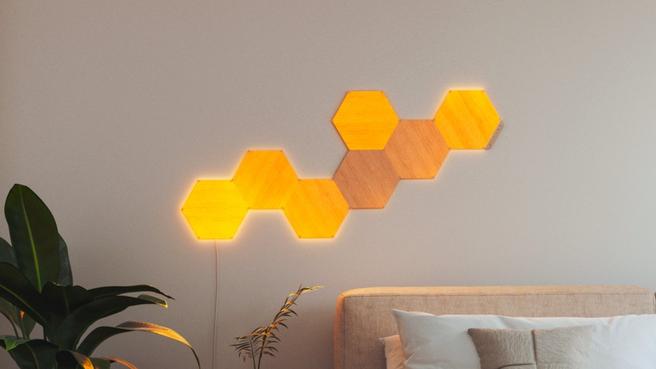
Once you've figured out your design (the Nanoleaf app has a cool, AR Layout Assistant that lets you superimpose it on your wall before pulling the trigger), you just peel and stick. We also used a level to make sure we had the panels lined up properly.
Each panel is connected to another by a linker and then you add the controller and power supply to one panel using any of the 6 slots. Finally, you plug it in and watch it light up (we do wish Nanoleaf could come up with a way to hide that cable).
The controller gives you analog access to power, brightness levels, and the option to turn on the flow or music visualizer feature - so you don't have to rely on an app for control.
There are also touch gestures you can program to do similar functions, plus change to different scenes by swiping across a panel.
When the panels are in place you get them connected to your smart home using Nanoleaf's app or by scanning the HomeKit code on the controller to add them to your Apple Home app.
The Elements work over 2.4 Ghz Wi-Fi, so no hub required. There is also a Thread radio on board. Nanoleaf has announced an update coming later this month will turn this on and enable the panel to be a Thread Border Router.
For more on this read our explainer on Thread, but the short version is this is excellent news for your future smart home - you just won't notice much of a difference right now - especially as the Elements panels will still use Wi-Fi as its protocol.
Nanoleaf Elements: Features & Smart Integrations
Boasting all the same features as its Shape-ly siblings - such as built-in music sync, touch control and response, plus a few more tricks we’ll get to in a minute - Elements work like any other smart lights.
You can turn them on and off with an app or with your voice - using Siri, Alexa or Google Assistant. You can also dim or brighten the same way and choose from a plethora of pre-set scenes. Using Apple HomeKit response time was instant, there was a half second delay with Alexa and Google Home app control.
Similarly voice control worked perfectly with Siri - even allowing you to set scenes with a simple command. Control through Alexa and Google was limited to on and off and some basic color changing. You can also add them to SmartThings or link into IFTTT.
Get Inspired: Best Nanoleaf designs - ideas, inspiration and the gear you need
You can set schedule for the lights to come on and turn off but you have to use the HomeKit or Google Home app to set this up currently, which is an odd choice.
If you connect through HomeKit all your HomeKit lights from any brand show up in the Nanoleaf app, so you can control them all from here, if you like. We wouldn't recommend it though, using Apple's Home app is a simpler experience.
There's also a circadian lighting feature in the Nanoleaf app that should match the color temperature of the lights to the natural sunlight throughout the day. But this feature wasn't working during our testing, possibly because we were using a Beta version of the app.
As with Shapes, Elements panels work with Touch Gestures and Touch Actions. The former lets you set a double tap or various swipe actions to turn the lights on or off, dim or brighten them, and switch scenes.
Touch Actions are configurable through the Apple Home app where the Elements show up as both a light and a Button. We set them to activate a Good Morning Scene with a single press and a Good Night Scene with a long press.
The single press worked consistently but the long press was hit or miss. This is because the touch sensitivity isn't the same as tapping on your smart phone, this is much more of a whack-a-mole effort.
You have to press surprisingly hard to get a reaction at all, and you have to use your whole hand, not just press it with your finger. Basically, you have to give it a high five, and whacking your $300 lights does feel a bit wrong.
But the main show here are the Scenes. These aren't lights you get so you can see your cereal better in the morning, these are a "visual experience."
Elements is much more impressive than its RGB siblings in this regard (if you can get past the fact that these lights do not have any color; which we know will be tough for some people). The texture of the wood grain and the edge-to-edge illumination and corner control make the effects really quite stunning.
The app comes pre-loaded with 11 scenes that take advantage of the panels' "organic motion" effects, which are a combination of motion and the "painting" of the light across the panels.
Descriptive titles like "Calming Waterfall," "Clouds," "Fireflies" and "Sunbeam" are spot on. You can create your own Scenes in the app but it's an involved process - ideal for graphic designers and other artists, but for most people using the pre-set Scenes, or downloading more from Nanoleaf's Discover tab in the app, will give you plenty of excellent options.
The color range is also pretty wide for white-only lights. You can go from bright white to warm oranges and everything in between, and the wood background adds a warmer tone to all the colors.
Shades we saw included golds, browns, and silvers, but even at the brightest white the lumen output is too low to use this for any type of task lighting; it's all ambiance all the way.


