Ah, the humble status LED. Just about every piece of home electronics, every circuit module, and anything else that draws current seems to have one. In the days of yore, a humble indicator gave a subtle glow from behind a panel, and this was fine. Then the 1990s happened, and everything got much much worse.
It’s Not The Technology, It’s How You Use It
The 1990s brought us much good: Nirvana, Linux, and of course the blue LED. Much like “Teen Spirit”, the latter quickly fell into overuse: the technology rapidly became the sigil of all that was new and great, much to the ocular pain of the buying public.
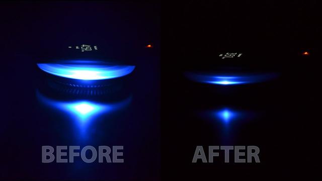
This decision ranks up there for stupidity with other such questionable choices as hiring a rental car at the airport, or invading Russia in the winter. A status LED, most would agree, is there to indicate status. It need only deliver enough light to be seen when observed by a querying eye. What it need not do is glow with the intensity of a dying star, or illuminate an entire room for that matter. But, in the desperate attempts of product designers to appear on the cutting edge, the new, brighter LED triumphed over all in these applications.
The pain this causes to the user is manifold. The number of electronic devices in the home has proliferated in past decades, the vast majority of which each have their own status LED. Worse, many of these are used in the bedroom, be it laptops, phone chargers, televisions, or others. With the increased brightness of these indicators, many of which are on all the time, the average sleeping space is lit like a Christmas tree.

The fad of using blue LEDs for power indicators only makes this problem worse. The human eye features special receptors sensitive to blue light that are not only used for vision.These cells are also used to detect the blue light from the sky, coordinating our internal Circadian rhythms to the Earth’s day/night cycle. Exposure to artificial blue light can interfere with this system, with research suggesting it may have a negative effect on sleep cycles.
Part of the problem is that the majority of LEDs on the market now are efficient, high brightness designs. These parts get included in designs with little regard for their excessive light output simply because it’s easy to do so, or maybe the designers have just failed to update their standard resistor value choices.
The fact is, if I can see a bright glow on the ceiling because I left Caps Lock on before retiring for bed, that’s a problem. The same goes for phone chargers and laptop chargers too. I shouldn’t have to wrap a device in several layers of electrical tape to hide a light that should be little more than a dim glow to begin with. If the device is reliable enough, I probably don’t need to be looking at it anyway!
Doing It Right
Of course, we love blinkenlights, and good status LEDs do serve a purpose. They tell us that we’re composing an highly aggressive email with the scary big letters, that our charger is indeed receiving delicious AC current, or that our monitor is receiving power but isn’t really, properly turned on (okay seriously, who cares?). Crucial as they are, there’s no excuse for getting them so badly wrong. It’s important to lay out a few rules to guide their proper implementation and use.
Excessive brightness should be avoided. As small LEDs can be easily dimmed with a simple resistor value change, there is no excuse for power or standby LEDs that light up a room. Instead, the level should be suited to typical use cases. 1980s home computers had no problems with excessively bright indicators, thus it is suggested that readings be taken from a sample of standard Amiga 500 power LEDs. The average value found should be the upper limit for power indicators on indoor electronic devices. It’s important to remember that you shouldn’t be looking at the power LED that often anyway, unless your hardware is highly unreliable. In that case, you have other problems.
Colors should also be standardised, or at the very least, chosen with some kind of thought as to effective visual communication. While I marvel at the pretty pink LED on Nintendo’s DSi, we had previously long established red as the color of a recording light, and thus there is little reason to differ. If your hardware must have a standby LED (again, really?), make it red or orange. Power LEDs should universally be green. None of this “blue for on” nonsense – it’s just showing off. It wasn’t cool in 2001, and it isn’t cool now.
The purpose of status LEDs should also be questioned. Too many LEDs, or too many colors, can be confusing. A laptop battery charge LED should be a single color, to indicate charging – ideally green. If it’s orange and green, what does that mean, exactly? Charging, and fully charged? Fault, and charging? If a user has to look up a manual to determine the meaning of a status LED, you can likely do better.
Flashing should only be used where absolutely necessary. LEDs for hard drive and network activity should flash, as they indicate a constantly changing state. Mute LEDs on a mixing board should flash, because they’ll save noob techs when they can’t figure out why no sound is coming out. On the other hand, a standby LED on a television should never flash, because if the TV is off, it’s because nobody wants to pay attention to it.
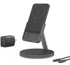
Hopefully, these rules serve as a starting point for hardware designers in future. No longer will a charging pad, designed for a bedside table, bathe an entire room in an eerie blue glow. A TV will not blink incessantly, keeping houseguests awake as they try to sleep on the couch. With a few changes, we may all rest soundly, free from glaring visual distractions as we go about our daily lives. Of course, this is just the opinion of one grizzled engineer. Be sure to sound off in the comments.


